
Reimagining the Trinity Integrative Medical Specialists logo
A logo doesn't need to be reinvented to be improved. We broke down Trinity Integrative Medical Specialists' mark and rebuilt it into a clean, flexible identity system that kept the brand equity patients already trusted.
An analysis of the original logo
Trinity Integrative Medical Specialists came to us with a logo built on a solid foundation: a shield mark symbolizing protection and legacy, with the practice's initials, T and M, locked together at the center for clear identification. Conceptually, it worked. In execution, it fell short.
Before we touched anything, we broke the existing logo down piece by piece to understand what was worth protecting and what was working against it.
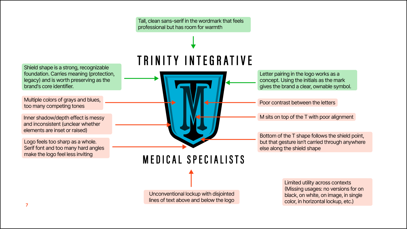
The logo was fighting itself in almost every direction. Competing blues and grays that never quite settled, an inner shadow effect that read as messy rather than dimensional, and a T and M that sat awkwardly on top of each other instead of aligning cleanly. The text lockup felt disjointed rather than unified. On top of that, the logo wasn’t flexible. There was no single-color option, no version that worked on a dark or light background, and nothing designed for a horizontal layout. A logo needs to hold up wherever it shows up, not just in the one format it was designed for.
Finding the right visual style
Trinity's brand voice is established and progressive: a practice that treats the whole patient, not just the symptoms. Credible, but warm. Before we redesigned the logo itself, we worked with Trinity to land on a broader creative direction that would guide the visual language of the brand. Once that direction was set, our job became clear: bring the shield into that world without losing what made it Trinity's.
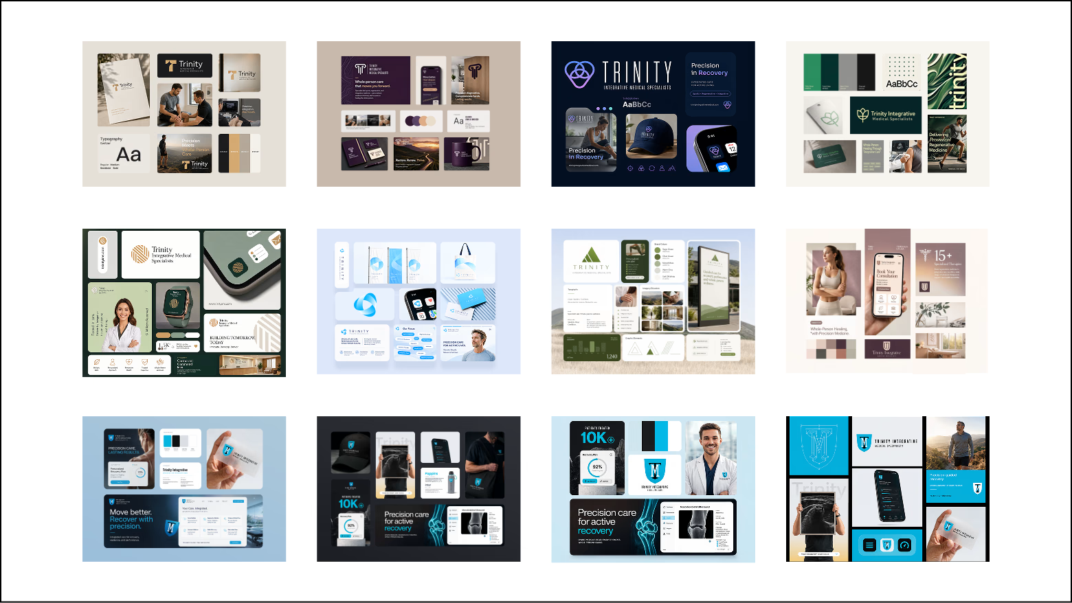
We put together a handful of directions for Trinity to react to in the format of style tiles, and this was the one that resonated, giving us a clear reference point for everything that came next.
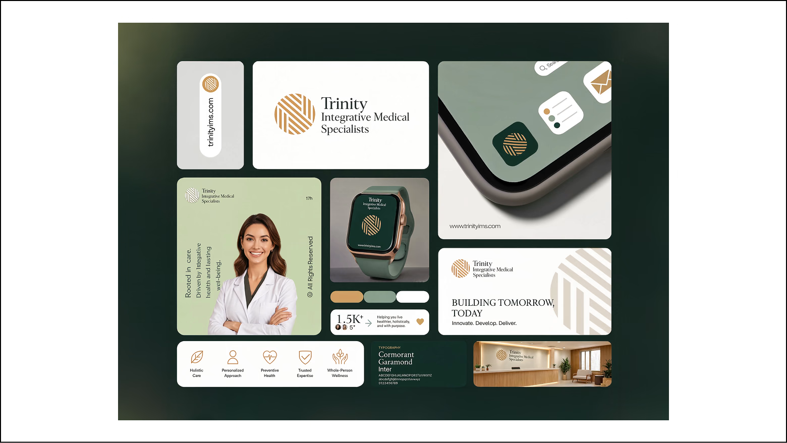
We ultimately landed on the above style tile, one built around a softer, more natural palette and a typography system with room to breathe, while still holding onto the structure and credibility of a clinical brand. The goal was a tone that felt like modern integrative care rather than sterile and overly clinical.
Exploring a sea of concepts
We started with pencil and paper, testing how far the shield and the letterforms could bend before they stopped feeling like Trinity.
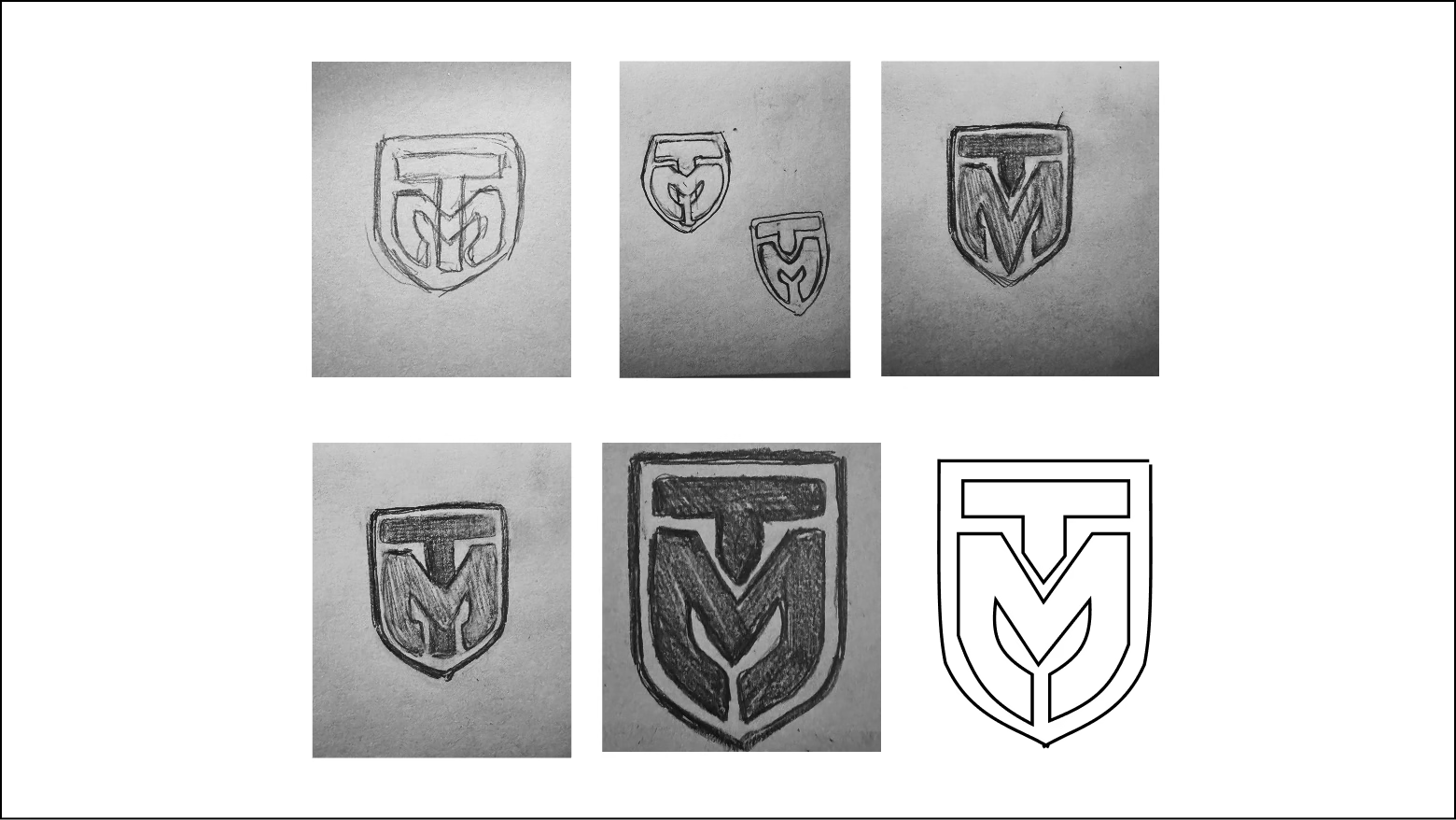
From there, we opened things up wide. Dozens of directions, different weights, different levels of abstraction, different ways of letting the T and the M share the same space.
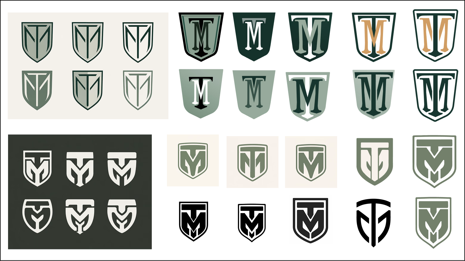
Not all of it worked, and it wasn't supposed to. We tried a few different approaches: letting the letters form the entire shield shape, opening the crest up so it felt lighter and less solid, and shaping the letters to flow with the shield's outline instead of just sitting inside it. The directions that showed the most promise were developed into full concepts, each with its own wordmark, color variations, and mocked-up applications so Trinity could see how it would actually look and feel in the real world.
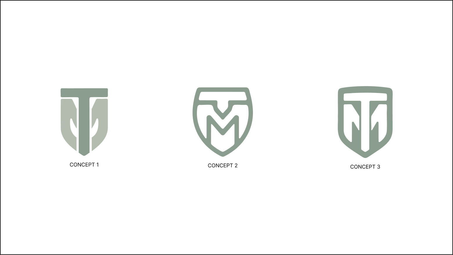
What the client actually responded to
We brought three fully developed concepts to Trinity, each one a real departure from the original: more modern, more open, more abstracted. All three tested well. But in that same round, we'd also shown a handful of rougher, more exploratory ideas that stayed close to the original's spirit. We almost left those out, since they felt like the safer, less ambitious option.
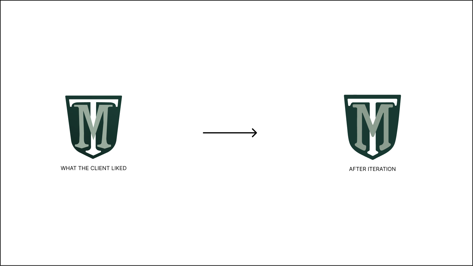
Trinity gravitated straight toward those sketches. Not because the other concepts were wrong, but because the original mark meant something to them. Their patients already recognized it, and the brand equity built into that shield and those two letters was real. What they wanted wasn't a new logo. They wanted this logo, finally rendered the way it should have looked from the start.
So we set the more radical directions aside and went back into that thread, pulling it further, resolving it, and building it out into a full system.
The final logo
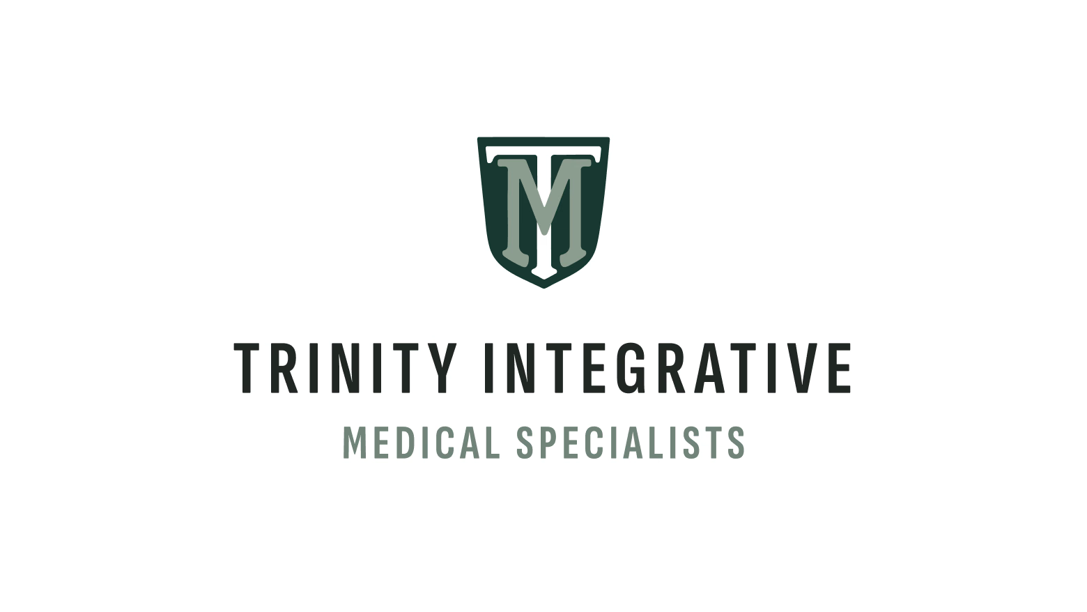
The final direction kept everything that made the original logo Trinity's: the same letter structure, the same shield silhouette, the T and M still locked together at the center. What we stripped away were the layers that made it feel loud, like the competing tones, the murky inner shadow, the heavy borders, and the sharp serif treatment. No gradients. No noise. Just clean structure and confident alignment.
Every problem we flagged in the teardown got a direct answer here. A single, intentional color story replaced the competing tones. Crisp, consistent alignment between the T and the M replaced the awkward stack. A tall, clean sans-serif wordmark brought in professionalism without losing warmth, and a lockup, both vertical and horizontal, finally felt unified instead of disjointed.
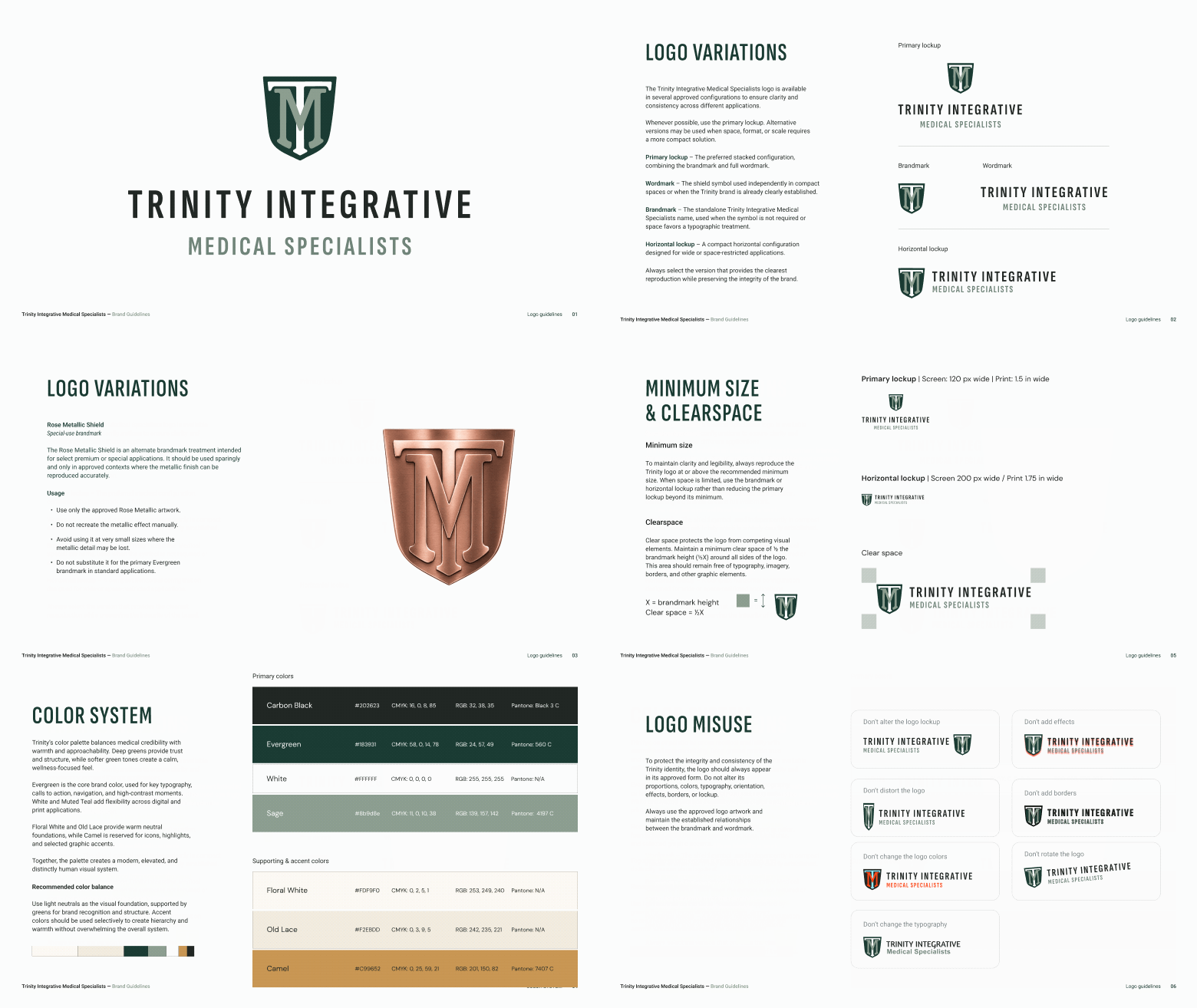
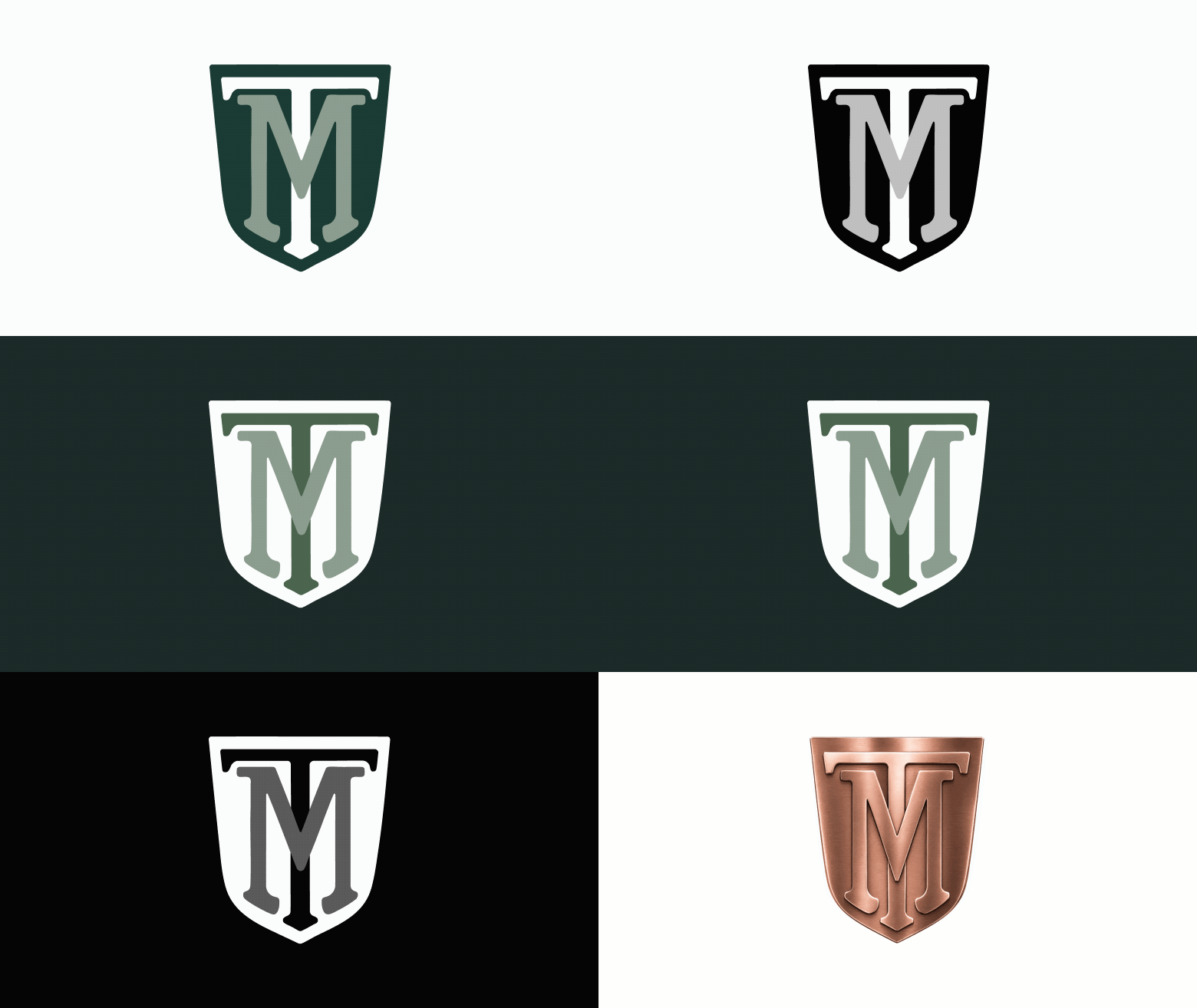
Because a logo has to work everywhere a brand shows up, we also built out the full system: on black, on white, in a single color, in the brand's green, and even in a metallic treatment for physical applications like signage or embossing.
Conclusion
It's tempting to measure a rebrand by how different the new logo looks from the old one. This project was a good reminder that the real measure is whether the mark does its job: whether it's legible, flexible, and consistent, and whether it still feels like the brand people already trust. We explored a much wider range of ideas than we ended up using, and none of that was wasted effort. It's what let us recognize the right direction the moment the client pointed at it.